Thursday, July 29, 2010

SCOTT BELSKY-behance

SCOTT BELSKY

Founder, CEO Behance
Scott Belsky doesn't exactly advertise that he's the grandson of test-prep king Stanley Kaplan, but he has a lot in common with the man who launched a $4 billion industry by tutoring immigrants for the SAT. "He always used this term 'meritocracy,' " Belsky recalls. "He was always hoping the smartest people would go to college rather than the people who had the connections and wealth."
Belsky's own mission is to help the most creative talent get the attention their work merits, regardless of their résumés. His Behance is a Web-based platform that allows everyone from a graphic designer in Poland to a makeup artist in Iowa to compete for the site's best real estate, based purely on peers' judgments of their work. A light-graffiti team in Cologne, Germany, was discovered on Behance by an ad agency for Sprint. A New York photographer and an Indian illustrator found each other and collaborated on a stunning image that Kanye West posted on his Web site.
Belsky's ultimate ambition is to make Behance the "epicenter of the creative world." The 30-year-old, who seems to subsist on half-eaten Clif bars, has launched sister sites from typography to fashion and this spring published a book, Making Ideas Happen. MTV, the professional design organization AIGA, and LinkedIn have partnered with Behance to use the platform for its members' portfolios. Behance has also attracted recruiters for such companies as Disney and Apple. "It's not just a bunch of people who went to ad school," says Sheila Larkin, senior creative recruitment manager for digital agency R/GA. "The diversity of talent on this Web site is a big plus."
Belsky is not only organizing the world's talent, he's also helping the talent get organized. "Our customers are the most creative people in the world. They don't need our help generating ideas," he says. "They need our help executing their ideas." In 2006, after four years at Goldman Sachs -- and hearing friends talk about startups they never hatched -- Belsky began to wonder why most ideas die during execution. Determined to figure it out, he left Goldman to study under creativity expert Teresa Amabile at Harvard Business School. ("I got into Harvard despite really bad standardized-test scores," he admits.) In interviews with more than 200 highly productive creative people, he discovered that the one thing they share is a "bias toward action." So when he created Behance three years ago, he included a design-forward Web-, mobile-, and notebook-based project-management system called the Action Method. In the Moleskine-style journal, now sold in more than 400 Barnes & Noble stores, one-third of each page has a brightly colored "Action Steps" section, intended, says Belsky, "to make people uncomfortable with how much of their space is taken up by action."
"Creativity without any sort of boundaries is chaos," says Beth Comstock, chief marketing officer of GE, who introduced the system to her staff. "It's this fun meme that's starting to spread [within GE]. Every day I notice some-body new comes into a meeting with an Action book."
And every day, more creatives convert to Behance. Two years ago, Ryan Seaman, a 32-year-old graphic designer in San Diego, posted his work, hoping to network with other artists. "When I was contacted by Pacific Sunwear, I was shocked," he says. Since then, he's designed more than two dozen pieces of artwork for the company's T-shirts. "Showing that a major company trusts me enough to do designs for them has helped me get new jobs in other industries," says Seaman. "It all roots back to Behance. That's where it all started."


Behance is a company that designs organizational products and services based on research among productive creative people and teams. The Behance Network is an online portfolio platform for creative professionals across multiple industries, including photography, graphic design, illustration, and fashion. Organizations such as the AIGA, ADC, and MTV have partnered with the Behance Network to create galleries of creative work. The company has also been vocal on the topic of crowdsourcing.

Wednesday, July 7, 2010

Coincidence?

I was looking up for typographic poster design on behance, accidentally, I found this Helvetica poster. http://www.behance.net/gallery/Type-Specimen-Vision-Testing/252745


 This like a eye testing chart. Really nice and simple concept.
People usually say red and green together is bullshit, but this one did work really well to create the colour contrast and eye-catching.


That's a exhibit poster hanging around my school, they got almost same concept. The first one came out about one year ago, apparently we can tell, there are some relations between them.
I don't know this could be call plagiarism or just get inspiration from it.
To be honest, I would like to say that this style seems to work better on this exhibit poster.  It breaks the eye testing chart format, and there are no disconnected words, those make it simple and clean, easy to read. To keep using the colour palette and hierarchy are smart movements.

What do you think about these two posters? Which article do you think will work best with this style?
 Do you think the second one is plagiarism? or self-development from their research, inspirations? What your opinion of plagiarism?

Monday, July 5, 2010

typography design

To start talking about typography, the first thing should be mentioned I think is Helvetica. "Best Fonts of All Time". It has been recognised as the most magic sans-serif typeface, world-widely used for anything...especially it is a popular choice for commercial wordmarks and everytime when you stucked with typeface, people always say... Helvetica.


Helvetica robort poster.

Later in 1982, some non-specialists designed really similar font with Helvetica—Arial. There are only some few differents details. Helvetica's strokes are typically cut either horizontally or vertically.
Personally, I do feel that Arial is more comfortable-look in glyphs R and t. The tail of the Arial R glyph is straightly lean to one side, likes you can straight your legs in an plane seat, that's more comfortable, isn't it. And the t, tilted cut at the top, makes it more flexible.

While we were doing the research of phobias, I found this meaninful the well designed fonts of fear. "The Book of Fears: Phobias from A to Z represents an alphabetical book showcasing typographic designs using the typeface Museo—created by Jos Buivenga of exljbris Font Foundry."

This T is most brilliant design one of the entire book I think. He breaks the leg of T and rotate it 90 degree, turn it to number 13.
Check out some more from— JONATHANGUY.CA —

Thursday, July 1, 2010

craft

While I was listeinig to the radio, they talked about today is 1st of July, it's half way through the year, that means the Christmas holiday is no far away...but actually there are still sooooo many months to wait...!!!

Talking about Christmas, every family are excited to decorate their house, to make some crafts.

How to make lovely Christmas Choirs and there are lots of crafts in familyfun website.


From all of the Christmas gifts, pop-up cards is one of my favourites. I was admired how could they built up the structure and Check these out: 1950s Hallmark Christmas card, collected by B-Key on flickr.


Warm, sweet colour gives readers an inside hug feel in the winter. The layers overlapped on each other are realy good. These classic styles are still eye-catching.


This is a really simple but nice one. The fold, layout and cut is easy. I love how it presented, to combine the card shape,colour with the lighting to work out the best result.
There is the website to teach how to make that Christmas tree pop-up gift card.


Those 3D popup postcard are 100% made in Italy. They are elegant and refined style. Detailed black outline on high quality materials used for their production make them an Exclusive and Distinguishing item.


This one is lovely too. simple and nice designed.

Wednesday, June 30, 2010

paper art


Yulia Brodskaya is an artist and illustrator born in 1983 in Moscow - Russia. She is very recognized for her astonishing, elegant and detailed paper illustrations. Currently based in the UK, where she went to continue her education in art at the University of Hertfordshire with a Master of Art in Graphics Communication degree in 2006. After getting her degree, Yulia continued to experiment and explore ways of bringing together all the things she likes most: typography, paper, and highly detailed hand-made craft objects. She has swiftly earned an international reputation for her innovative paper illustrations and continues to create beautifully detailed paper designs for clients all around the world.

Let's enjoy some of her amazing works.

she worked great on the paper without any colours. And looked at the hair, the detail, that's the most amazing part.

swirls are used a lot in her works, they are really nice shape. the colour is similary in one piece of work.


This is my favourite one, the navy blue and grass green give u the imagination from her head. The sun, flowers, leaves and waves. In comparison, her face is simple and it really thoughtful to have the shadows.

“Typography is my second love, after paper and I’m really happy that I’ve found a way of combining the two. " Said Yulia.

view her website to see much more amazing work: www.artyulia.com

Ref: http://abduzeedo.com/astonishing-paper-illustration-yulia-brodskaya 
..................

Monday, June 28, 2010

Pop art

Pop art is an art movement that emerged in the mid 1950s in Britain and in the late 1950s in the United States. Pop art challenged tradition by asserting that an artist's use of the mass-produced visual commodities of popular culture is contiguous with the perspective of fine art. Pop removes the material from its context and isolates the object, or combines it with other objects, for contemplation.

pop art is widely interpreted as a reaction to the then-dominant ideas of abstract expressionism, as well as an expansion upon them. Much of pop art is considered incongruent, as the conceptual practices that are often used make it difficult for some to readily comprehend.

Pop art (like that of Andy Warhol) generally consists of the following:
-Bright, quirky colors that stand out, sometimes neon.
-Ordinary objects being turned into art.
-Four paintings of the same picture using four different hues.
-Focusing on the contours, shapes, and basics of a picture

The term Pop art was first used by English critic, Lawrence Alloway in 1958 in an edition of Architectural Digest. He was describing all post-war work centered on consumerism and materialism, and that rejected the psychological allusions of Abstract Expressionism. An attempt to bring art back into American daily life, it rejected abstract painting because of its sophisticated and elite nature. Pop Art shattered the divide between the commercial arts and the fine arts. http://wwar.com/masters/movements/pop_art.html


Richard Hamilton’s collage Just What Is It that Makes Today’s Homes So Different, So Appealing? (1956) is considered by some critics and historians to be the first work of Pop Art. The piece has all the human senses cast in various modes; the purpose of the picture was to “provoke acute awareness of the sensory functions in an environmental situation”.


Andy Warhol was a central figure in the pop art movement. His early paintings show images taken from cartoons and advertisements, hand-painted with paint drips.


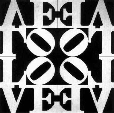
Robert Indiana was using distinctive imagery drawing on commercial art approaches blended with existentialism, that gradually moved toward what Indiana calls “sculptural poems”. Indiana’s work often consists of bold, simple, iconic images, especially numbers and short words like “EAT”, “HUG”, and “LOVE”. One of the best known works by Indiana is Love Rising (1968)

Famous pop art artist:
Andy Warhol
David Hockney
Jasper Johns
Keith Haring
Peter Max
Richard Hamilton
Tom Wesselmann
Wayne Thiebaud


modern pop art

Kevin Cherry.     I like how he used the black backgroud with snatchy edges to separate the elements. The colour contrast, bold typeface, drips are all nice.

Sung-Ho Bae. The winner of Adobe – Education:2007 Adobe Design Achievement Awards. Title: Nine inverse proportion problems we have.
The concept is great. The layout of the poster is nice. I like the colour and texture as well.


Thursday, June 24, 2010

Stunning digital photography

Romain Laurent (Paris France)
This series of stunning digital photography works outstanding. The view angle is innovative, The composition-person and background sets up like an 90 degree V. The vintage background is really nice and work well with the bright lights. The emotion he catched is pretty good as well.

This one works brilliant with the shadow and the folding of the skirt straights down., makes it more realistic.

Love this one the boy with the skateboard, that looks like the hardest one to complete.

Funny long stockings and flaming mouth lips. Straight eye connection to the top right corner. busy background. this seems like the most strange one but it has lots of  interesting points as well.

The old man at this age holding a cup of coffee, walks like this, it's really unblievable. I like the sun lights in this photo best, even though it wee bit over expored.

You wanna to more about him, check his website http://www.romain-laurent.com/ , you will be impressed!

Monday, June 21, 2010

Tatoo art

Tatoo art

 I have never been interested in tatto until I watched Prison Break. For me, tatto was like something tearing burn on your skin. Someone got tattos to show their courage, someone got tattos to remember one heart-breaking love ... ...
Now I know it could be really cool, it's full of wisdom and art.


Come across Shawn Barber from Marie's blog. Shawn Barber, which very skilled oil painter and illustrator, illustrated for everything from The Rolling Stone to the Wall Street Journal, and he's shown his paintings in galleries around the world. His recent work is Tatto Portraits.

This photo-realistic style painting, vibrant colour, delicate design are all catch my eyes.
Lucky me, got some acrylic painting stuff from the icreat room, see what I did for myself~lol

 
There is a snake comes out under the leaf.

Sunday, June 20, 2010

Late night

When the mid-night coming soon, so quite in my little lovely room. Deep thinking, and doesn't feel lonely.

Wandering on the internet and see if there are some amazing thing I could encounter.


karoly kiralyfalvi
Love this poster, used repeatation of the pattern to make the type out of the negative space.


there is no outline around the fonts, but crayon colour works the separation, and the crayon colour is quite nice on the background texture. The interesting sketches inside the type is a little childish, really arrtactive though.


Patrycja Zywert

He did couple of pretty cool typographic posters, I love this one a lot may because of the words. "Good design is turning complex into simplicity." He used only sans-serif font for GOOD and SIMPLICITY to make them different and outstanding. The perspective of this poster is creative by using skew, darker colour to make them  3D tyle. Personally, I think it could be better to add some depth, make the font like a block rather than a plain type there.


What do you think of these posters? 

Do you agree that good design is turning complex into simplicity? 


Thursday, June 17, 2010

Lighting in photographic portrait

View others' black & white portraits  with envy,  I was always interested the story behind the b&w photos. How could them tell their story without color.

 "High key portraiture is synonymous with the contemporary trend for the minimalist, clutter-free style made popular by family studio. Characterized by over exposure and desaturated colours. This style is bright, breezy and optimistic." /Ref: High and Lows By Josie Reavely (2010 June). Advanced Photoshop ISSUE65 Pg.60


 Look at this bright smile, it will lit up the world!

"Low key portraiture is darker, more brooding and moodier. It’s marked by an underexposed and high contrast look, this type of lighting works well with more somber imagery. Background tend to be dark with subjects often fully or partially silhouetted, with key features picked out by one key light. The dodge and burn tools are great for making selective adjustments to specific areas of your images. Use the drop-down range menu to make adjustments to the shadow , midtones and highlights individually." /Ref: High and Lows By Josie (2010 June). Advanced ReavelyPhotoshop ISSUE65 Pg.62

 
Giggling in the dark. Have you notice the label on my face? That the pass of Auckland war museum.

It's interesting to doing something on my own photo right after learn them, but the original photo quality is poor, so it doesn't turn out really well.

So let have a look at some real photographers' portrait works. 

Low key works with some blurry to make the portrait even better. 
/Ref: E M Photography will be returning your wonderful c's photostream (February 17, 2009). Retrieved June 17, 2010  from http://www.flickr.com/photos/elegant_memories/3285701898/

High key: Bright and refresh.
/Ref: Carolina in Black & White by Brian Dowling (July 26, 2009). Retrieved June 17, 2010 from http://www.flickr.com/photos/bridow/3755287980/

This portrait seems combine the merits of high and low keys. Really nice lighting set up.
/Ref:Julie in Black & White by Brian Dowling (August 27, 2009). Retrieved June 17, 2010 fromhttp://www.flickr.com/photos/bridow/3858999075/
 

Thursday, June 10, 2010

Function VS Form

If we compare Function and form as a person, then the form is the appearance , function is the organic and personality. With beautiful form (Appearance), you may attract more attention. If form used for product packages, customers may purchase the well-packaged one at the first time, however, the function is the inside. For people, we can’t live without any organic. We would die. For products, anything doesn’t work without function, that’s useless. Customers may purchase the bad stuff with good form once, but there won’t be a second time.

Function works it purpose, it’s the basic of everything. Function has influence to more people, so that’s the way to change world. If form could be fashion design, it changes the fashion trend, the way people wears, but people always have to wear something, no matter pants, skirts or silk stocking, no matter how long or short, thin or think they are, you always have to wear them, that’s the function. It is about utility, form is merely a piece of iconography.

Simplicity isn’t equal to bad or no function at all. There are some more new innovative form design which are quite simple. People regard less form means less functions, actually it’s not. For assistant,, the latest revealed Apple mouse, it’s shape is simple and clean, streamlined design, whereas, it still have all the functions like right/left click, scroll. It’s Bluetooth without lines, but it still has to connect to the computer, it just changes how it looks like, the form. It likes people , they could make up, face lifting even do transsexual operation, but the inside, all the functions run as normal. Function is timeless, edgeless.

Form serves for function, without good function, there is no good product, nice personality. Form does well for eye catching, it helps customers, the others easy to accept the stud at first sign, but time will tell after a long run, so run good function is more significant than good form.

At last, I came up with a new question. If I consider function over form, why I do graphic design?

This will go back to what the form used for. It serves function, it helps the functions to work well. For example, a good product need good advertisement to spread out; a junior designer need some good references to get a job.

In conclusion, function is over form, form serves function. They both are parts a "person". They help each other.

Wednesday, June 9, 2010

Cubism

1906 Spanish artist Pablo Picasso (1881-1973)
1907 Huge canvas Les Demoiselles d's avignon., the painting represent not only a radical new phase in Picasso's art, but the beginning of truly modern art. It's also the first Cubist work.

Les Demoiselles d'Avignon (Pablo Picasso, 1907 Oil on canvas)

The formal qualities of this painting were crucially important for the development of Cubism; the nudes are treated in a structured, geometric way, their figures twisted into unnatural poses. The background is also treated in a fractured way and is pushed forward into the composition.

Picasso said that Art is a lie that makes us realize the truth. The difficulty in reading Cubist works highlights one of their contrail ambiguities: weather or not their aim is to  represent reality, or even to represent anything at all.

One important feature of Cubism is the enhanced expression role given to the formal qualities of a painting. In many works objects lack partial integrity and merge with those around them, and this device can be broadly related to the perceived compression of the time ans space created by new forms of communication.

Georges Braque (1882-1963) is another important cubist. He began to experiment with a more sculptural style. He mostly treated landscapes, focusing on features such as building and viaducts.


Harbour in Normandy (Georges Braque, 1909 Oil on canvas)

Strong, geometrical structure. Bright, subdued colour. He made great progress in his handing of space and volume using facets of colours.


Seated nude (Palo Picasso, 1910 Oil on canvas)

This figure is treated in facets bot not rally fragmented, rather the planes follow the contours and surface of body, the whole remaining easily recognizable.  By comparison with barque's works, this painting night seem timid.


Woman with a Mandolin (Georges Braque ,1910)

This is the first Cubist work to use an oval format. Here it also echoes the form of the composition, framing it better than would a rectangular canvas.

While I was googling the Cubism works, there are lots of different styled works under the same name. The cubism is quite unique and outstanding.

That's the early time of Cubism. In 1912, aware of that they had carried analytical Cubism as far as possible, Picasso and Braque developed several new techniques. Braque learned stencil and how to use steel combos to stimulate the effect of wood grain (Faux bois).
Good Friends help each other to progress. Their friendship could be admired and extolled forever.
Other famous, important Cubist
Paul Cezanne
Fernando Leger
Marc Chagall
Juan Gris

Ref: Cubism,Philio Cooper. Published at Phaidon Press Limited 1995
       Cubsim, Pierre Cabanne.. Published at Finest S.A./editions pierre terrail, Paris 2001